


Modernising SoftSolutions’ flagship trading platform posed some interesting UX design challenges. Emiliano Bernardini, Head of UI Console Development explains:
The modern concepts of User Experience can sometimes conflict with the needs of a financial application used on trading floors.
Usability is paramount – but how do you make an application intuitive to use out of the box, and at the same time satisfy the trader’s need to pack in as much information onto the precious desktop real-estate – as well as make it look current and “in vogue”.
SoftSolutions! nexRates is the company’s lead trading product, live at a number of European and Japanese firms. It’s an integrated market making and e-trading solution for Fixed Income markets. Given its rich functionality and trading capabilities, it’s hard to understand all the features that are offered by the User Interface unless there is some understanding of how the markets work and the trading strategies that our clients like to use.
We can really say that it’s a cutting edge technology in its domain but that does mean that, unless you are a trader, it may not be intuitive to use. Futhermore, this rich functionality was masked by our previous UI, which had the look and feel of a Windows 95 application. In the past, the principal development focus on the nexRates team had always been about trading functionality – as the perception was that traders didn’t care about aesthetics – only usability.
However, this was not true. The old UI created the wrong expectations. When we were demoing the previous version of our platform, the audience had a perception that the product was not innovative thus they were concerned about buying something that seemed to be “old technology”. We clearly needed to make some changes.
As a UX expert, our goal is about creating a positive response, so the user will stay longer and return often while keeping an eye on the constraints of the working environment that the application has to fit into.
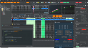
Traders take important decisions and these decisions depend on data.
So our application needed to present significant amounts of data in an accessible and readable way. And if something important happens in the market, in amongst all of the data displayed on the screen, we need to draw the trader’s attention to it.
As soon as the challenge was clear, the first problem faced was the choice of the overall theme: A light one? A dark one?
SoftSolutions! nexRates already had a well known UI – and that UI was based around a light theme. In most cases, a light background is easier to work with for one simple reason: black text on white background means better contrast, scanning perception and readability. According to many scientific studies, optimal legibility requires black text on a white background. There is also an expectation: people are used to seeing a variety of content rendered with dark ink on a white background presented along with images.
But when we looked to redesign the UI, we chose a dark theme: Why?
With an increase in digital technology, we stare at screens for most of the day… as do our customers. nexRates is used continuously through the trading day and the main risk is to suffer eye strain. A dark theme minimizes pain and makes day by day usage more comfortable.
Comfort cannot be the only key driver in our choice. As already said, nexRates needs to present a lot of information in a very concise way. So, even if it’s true that modern applications tend to prefer an “airy”, spacious layout with generous margins, this was not going to be an option.
So how were we going to achieve our design goal?
The approach chosen was to split the main goal into a number of strategies. The main strategies we employed are listed below:
- At global application level, achieve a strong, dramatic look for striking visuals – projecting a feeling of style.
- Icon set should be easy to read and consistent across the whole application. This will ease the navigation and access to the main features of the application
- In grids, avoid pure black. A dark theme doesn’t have to be pure white text on a pure black background. In fact, that high contrast can be painful to look at. It’s safer to use dark grey as the primary surface colour for components, rather than true black
- Avoid using saturated colours on dark themes. Saturated colours which can look great on light surfaces, can visually vibrate against dark surfaces, making them harder to read. Desaturase primary colours in order to make the contrast enough against the dark surface.
- Communicate depth. Similar to light theme design, when it comes to creating dark theme UI it’s essential to create hierarchy and emphasize important elements in your layout. In dark themes elevated surfaces and components are coloured using overlays. The higher a surface’s elevation, the lighter that surface becomes.
- Keep colour coding consistent across the whole application. Reds, greens are emotional colours and also important ones for the financial sector. So we associate for each colour an action or a specific feedback to the user. It was important not to mess the user about with unclear messages expressed via colours. This is so important that accent colours and secondary palette should be “written in stone” and well explained.
The process of crossing over to the “dark side” had to be approached with care and, we have delivered.
SoftSolutions! nexRates now provides a more compelling interface for our clients a slick, modern design which combines the sense of innovation but still maintains the familiarity and ease of use.
We are pleased with the outcome, but would be interested in your feedback. Get in touch with us to learn about the nexRates platform and arrange a demo.